Thermo Fisher Scientific
Antibodies Image Search
Overview
Thermo Fisher Scientific is the world leader in serving science. They offer thousands of primary and secondary antibodies validated and cited for flow cytometry, western blotting, ELISA, and other applications. We’re continuously looking at new ways of displaying search results and providing the most relevant information to our users. This tool was designed to allow users to explore a full portfolio of images, making it easier to find and evaluate the antibodies they need. Our goal was to enhance the user journey by introducing image data set search functionality, streamlining the exploration and purchasing process for researchers and scientists alike.
Challenge
The primary challenge was to create an intuitive and efficient search experience within a vast and complex portfolio of antibody images. Traditional search results often fall short in providing researchers a quick and easy way to identify antibodies suitable for their experiments. The different types of available antibodies required a solution that could streamline the selection process while ensuring accuracy and relevance.
UX Design Process
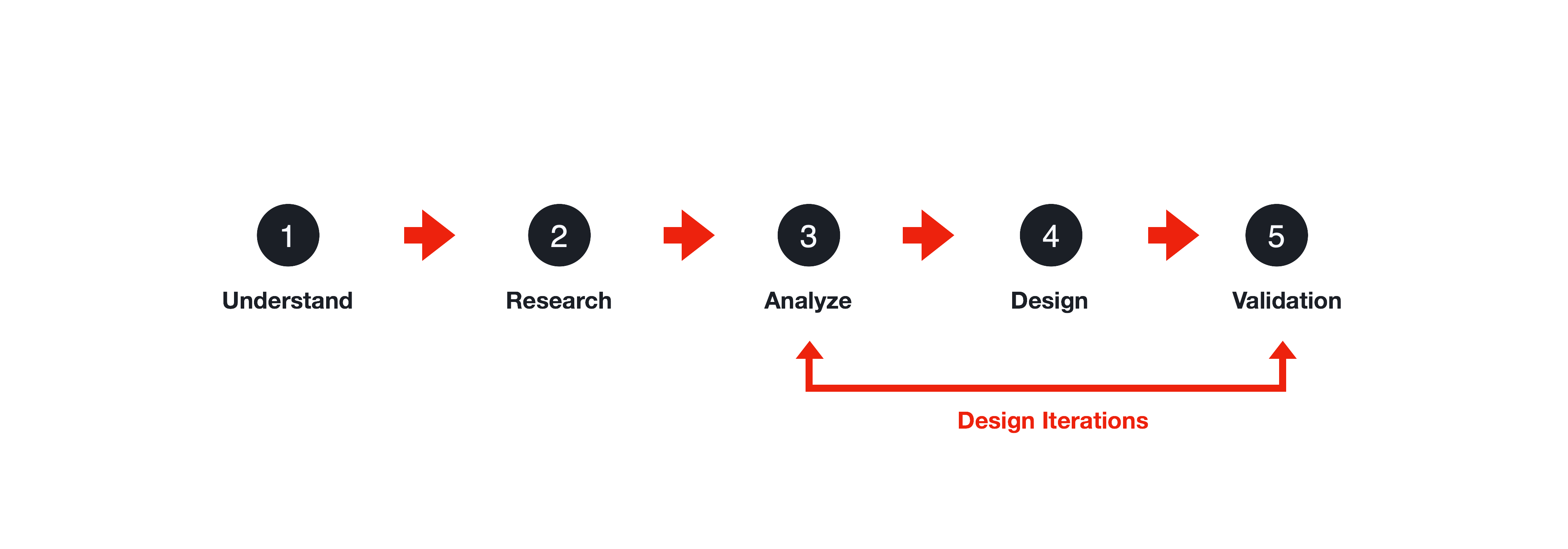
The UX design process was broken into five steps:
- Understand: Grasp user needs and project goals
- Research: Gather insights from users, stakeholders, and competitors
- Analyze: Interpret data and identify key requirements
- Design: Create intuitive and visually appealing wireframes and prototypes
- Validation: Test and refine the design based on user feedback
Understand
We worked closely with the antibodies team to understand our users, accurately frame the problem, and define business requirements. By aligning with their goals and leveraging their expertise, we gained a comprehensive understanding of the challenges researchers faced with existing search methods. This collaborative approach allowed us to set clear, actionable objectives that would guide the design process and ensure our solution met user needs.
Mind Mapping
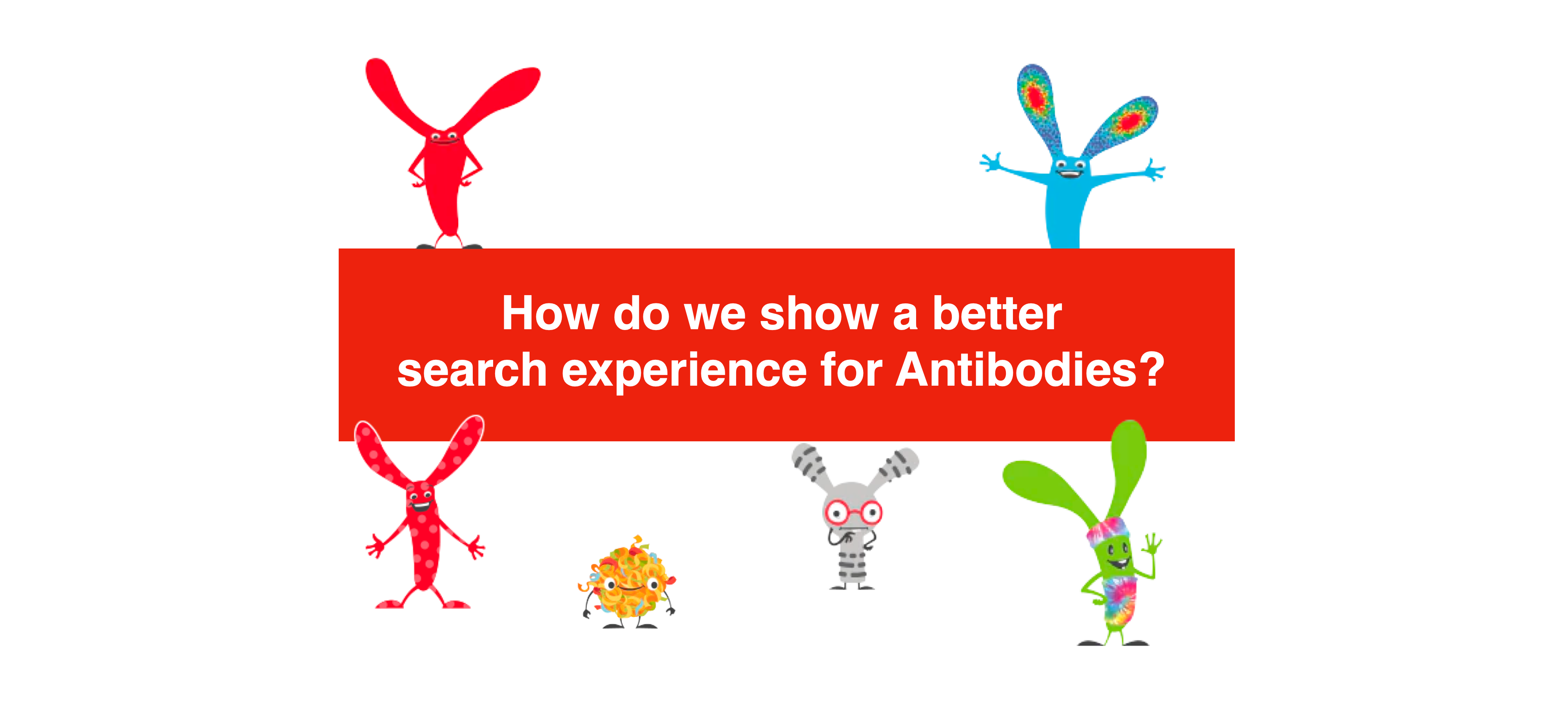
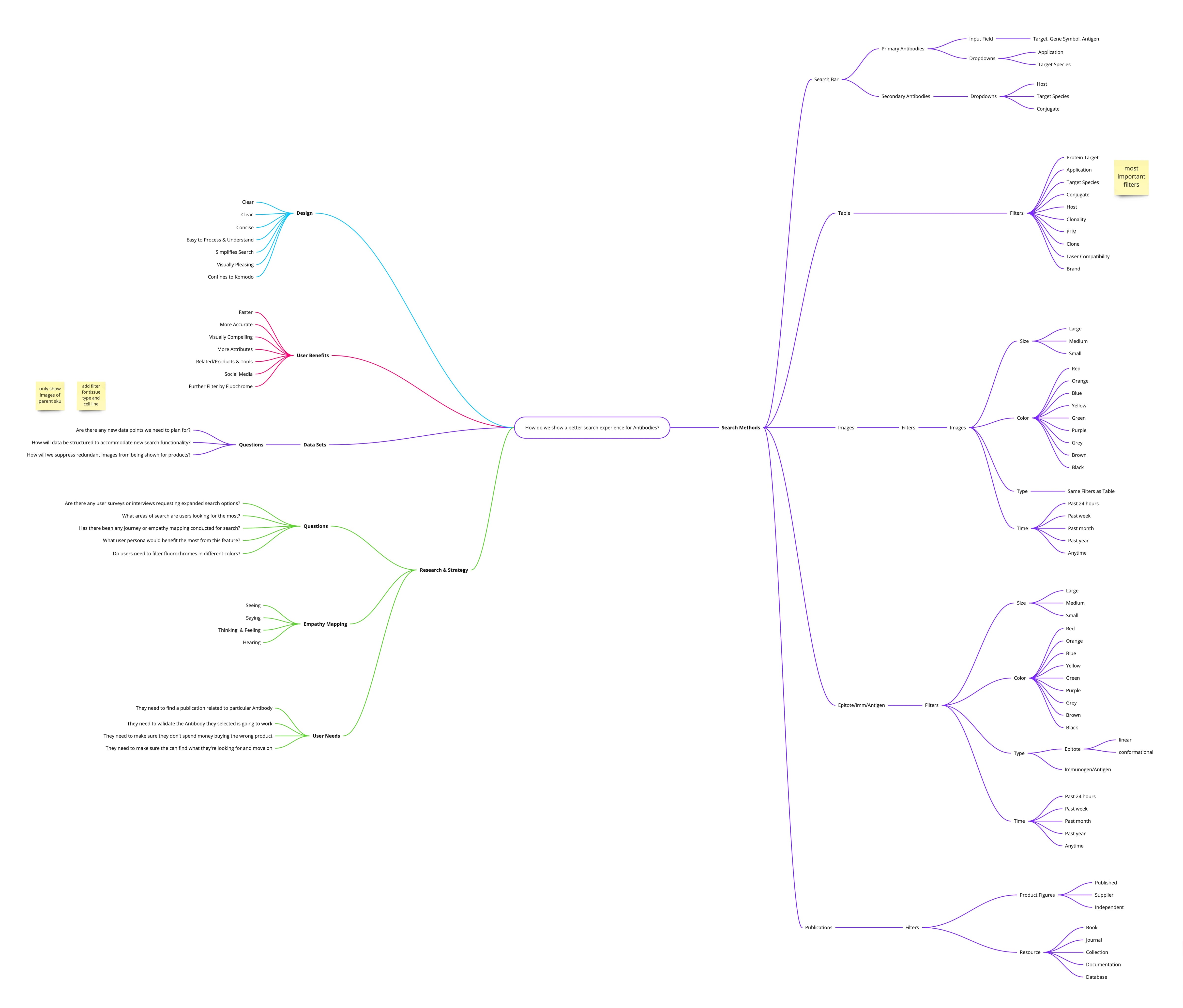
Our central problem statement was: “How do we show a better search experience for Antibodies?” This guided our mind mapping process as we broke apart our ideas into distinct areas, ensuring a comprehensive approach to the solution.
Research
We conducted voice of customer and stakeholder interviews to gather insights from researchers, lab technicians, and other key users. By engaging directly with these users, we gained a deep understanding of their challenges with current search methods, their criteria for selecting antibodies, and their expectations for a more efficient search experience. They all felt passionately an image search would benefit our users and allow them to make better purchasing decisions.
A few things we learned with our initial research:
- Advanced Filtering Options: Users required advanced filtering options to narrow down results.
- High-Quality Images: Images were crucial for effective antibody evaluation and decision making
- Detailed Information: Users want comprehensive validation information to make informed decisions.
- Intuitive Navigation: Users favored a straightforward approach to minimize clicks and reach results quickly.
- Speed & Efficiency: Researchers want a fast and efficient search process to save time.
Analyze
Competitive Analysis
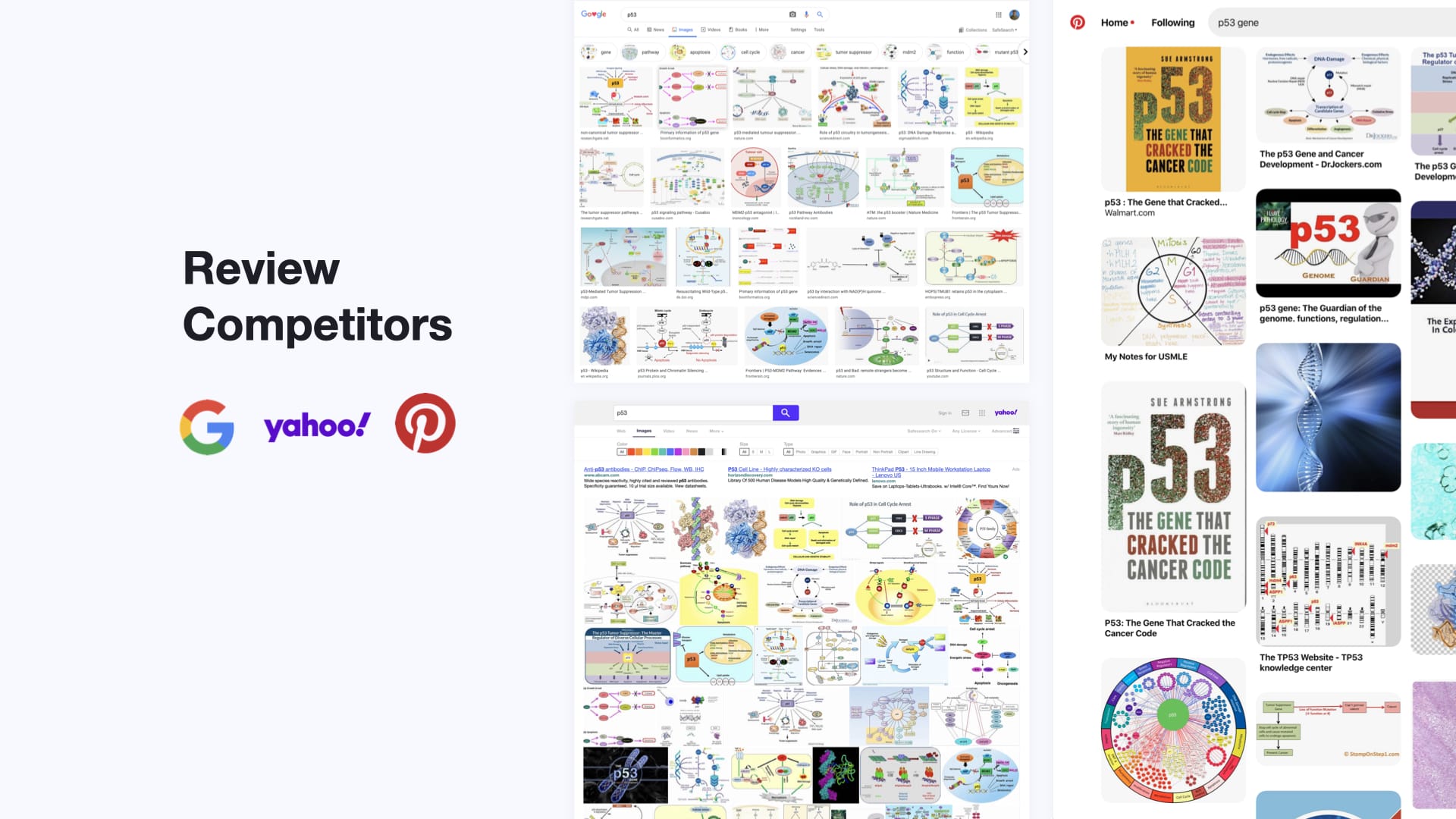
We drew inspiration from leading platforms like Google, Yahoo, and Pinterest to understand their effective search functionalities and user-friendly designs. By analyzing their approaches to image search, layout organization, and user interaction, we identified best practices and innovative features that could be adapted to enhance the antibody search experience.
Design
We translated user requirements and feedback into a cohesive design, incorporating essential elements and interactive features to improve the search experience. This phase involved iterative refinement based on usability testing, ensuring that the final design was both appealing and effective in meeting researchers’ needs.
Wireframes
We created wireframes to help establish the structure of the page before images and content are added. This allowed us talk through different layouts and determine the hierarchy of elements before exploring possible design solutions.
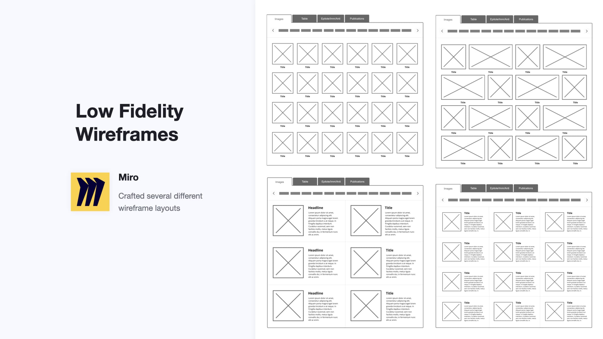
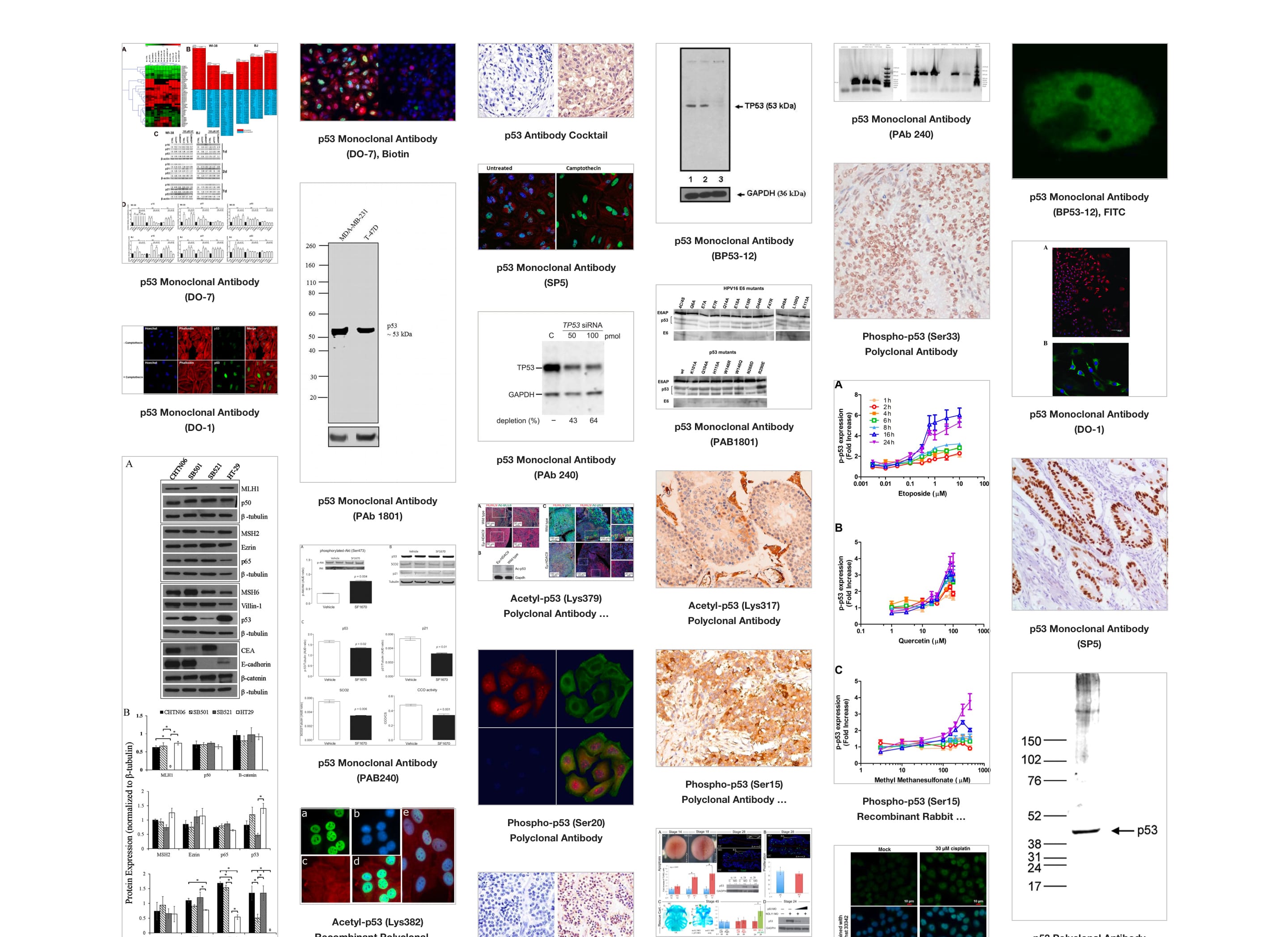
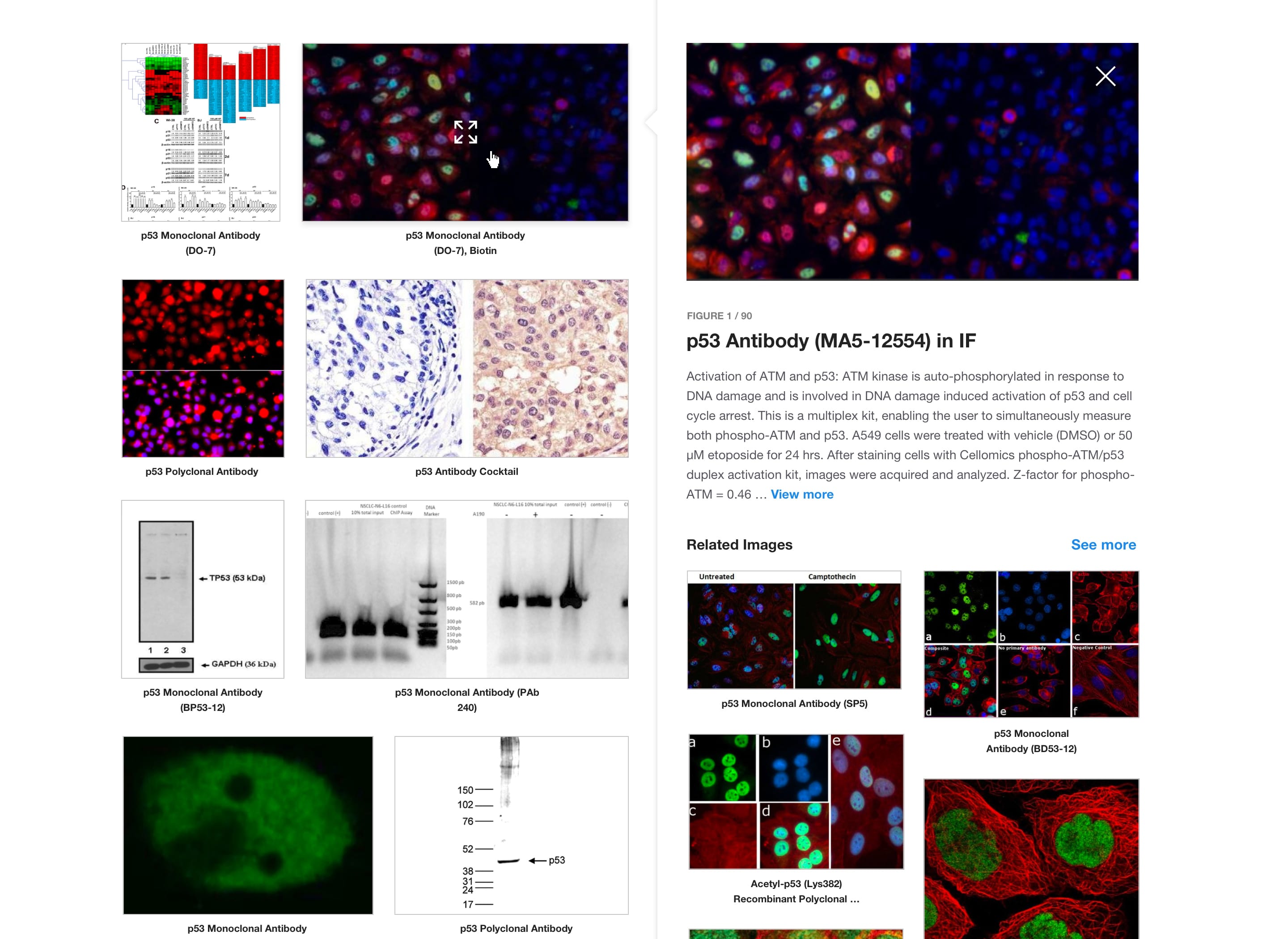
Image Grid Exploration
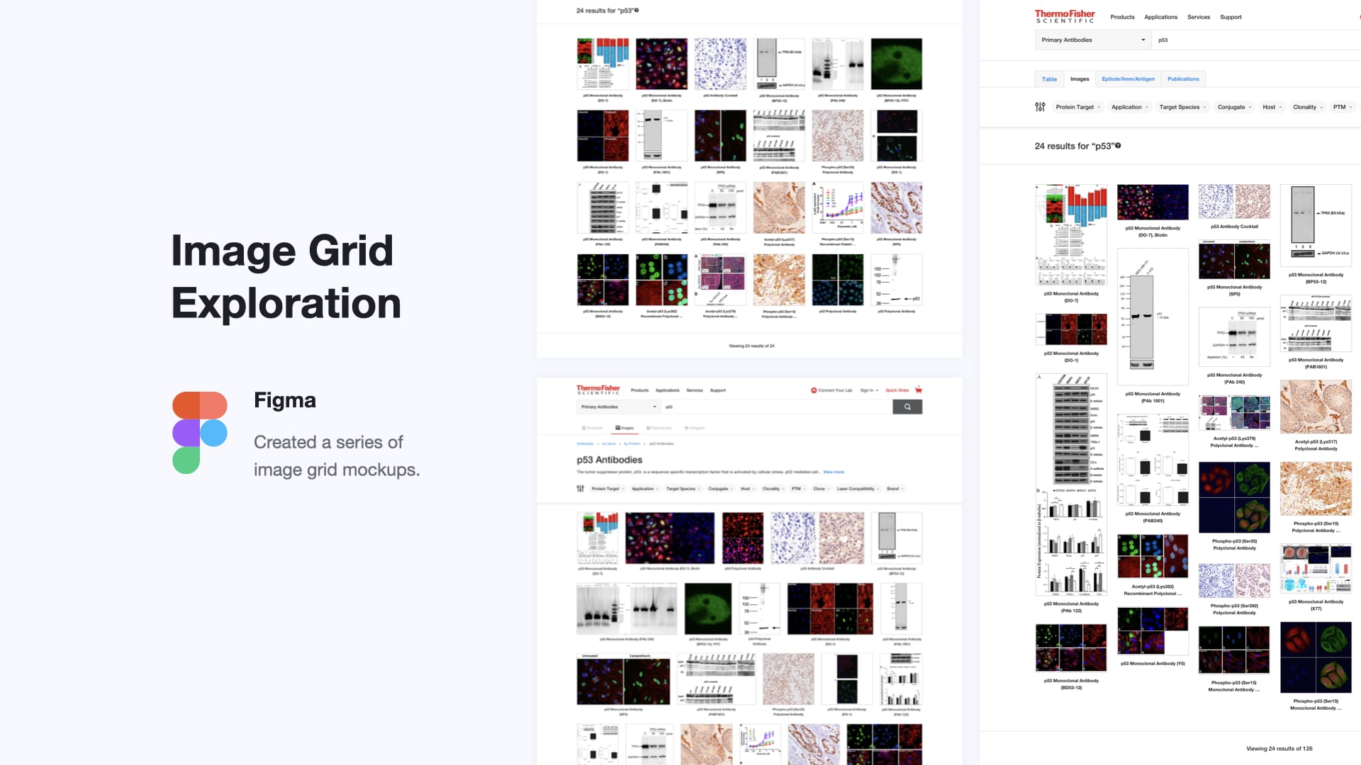
In the design phase, we experimented with different image grid formats based on the initial wireframes. Our goal was to find the most effective layout that would enhance user engagement and make the search process intuitive. We considered various grid formats, including:
Uniform Grid
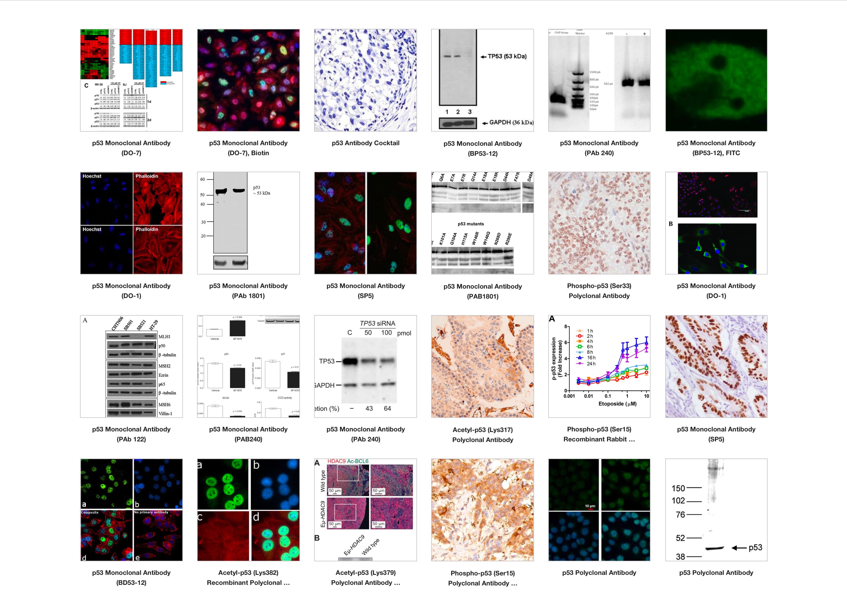
Displaying all images in equal-sized thumbnails to maintain visual consistency and easy scanning.
Masonry Grid
Allowing images of different sizes to create a dynamic, visually appealing layout.
Panel View
Providing a detailed view where users can open up a panel to view additional information next to each image.
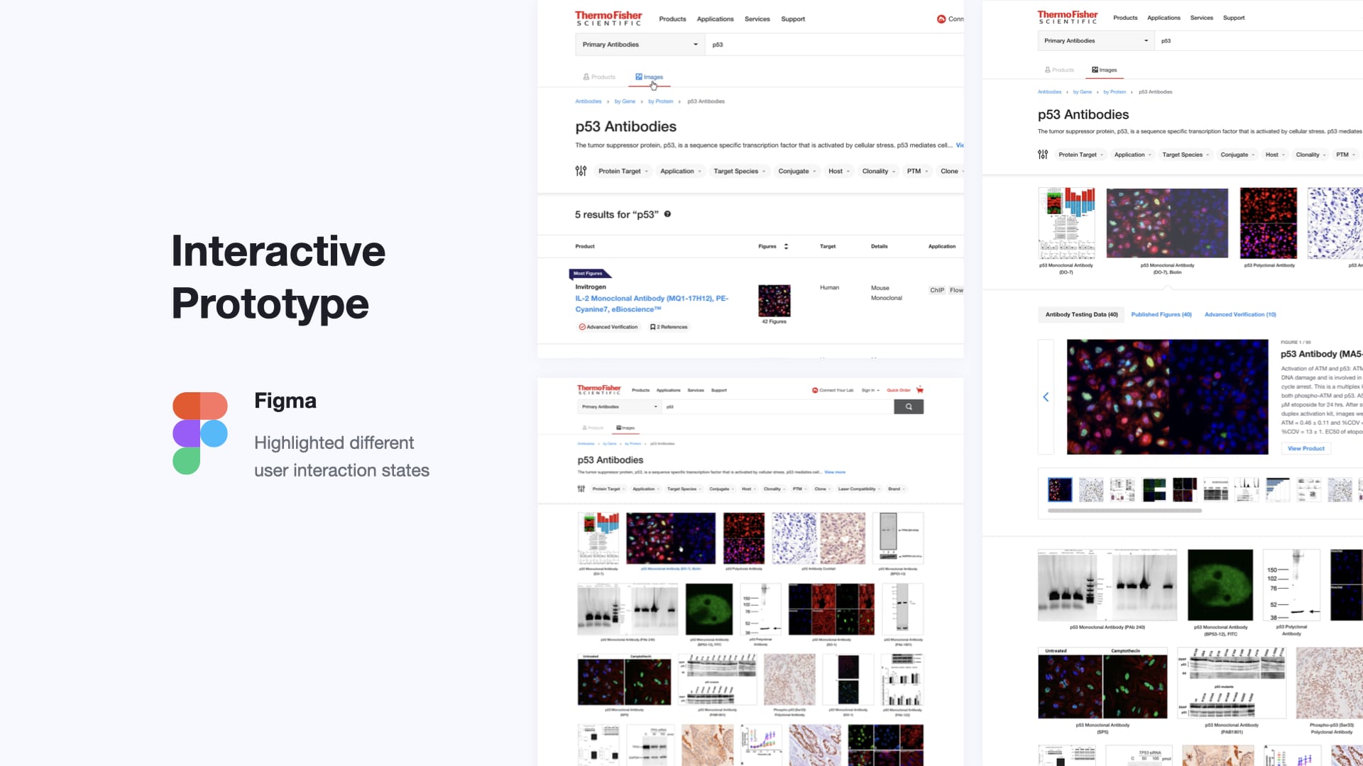
Prototyping
With established concepts, we dove into rapid prototyping, translating our ideas into tangible interfaces. Through iterative iterations, we fine-tuned the design, incorporating user feedback at every step of the way. These prototypes allowed us to test different layouts, functionalities, and interactions, ensuring that the final product would meet users’ needs and expectations.
Validation
We conducted usability testing with real users to gather feedback and identify any issues. This involved observing users interact with the design and assessing how well it met their needs.
Usability Testing
With the help of the customer insights team, we developed a usability plan that enabled us to gather detailed feedback on areas for improvement. These insights guided us in refining the design, addressing usability concerns, and enhancing overall effectiveness, ensuring the final iteration was well-received by our target audience before development began.
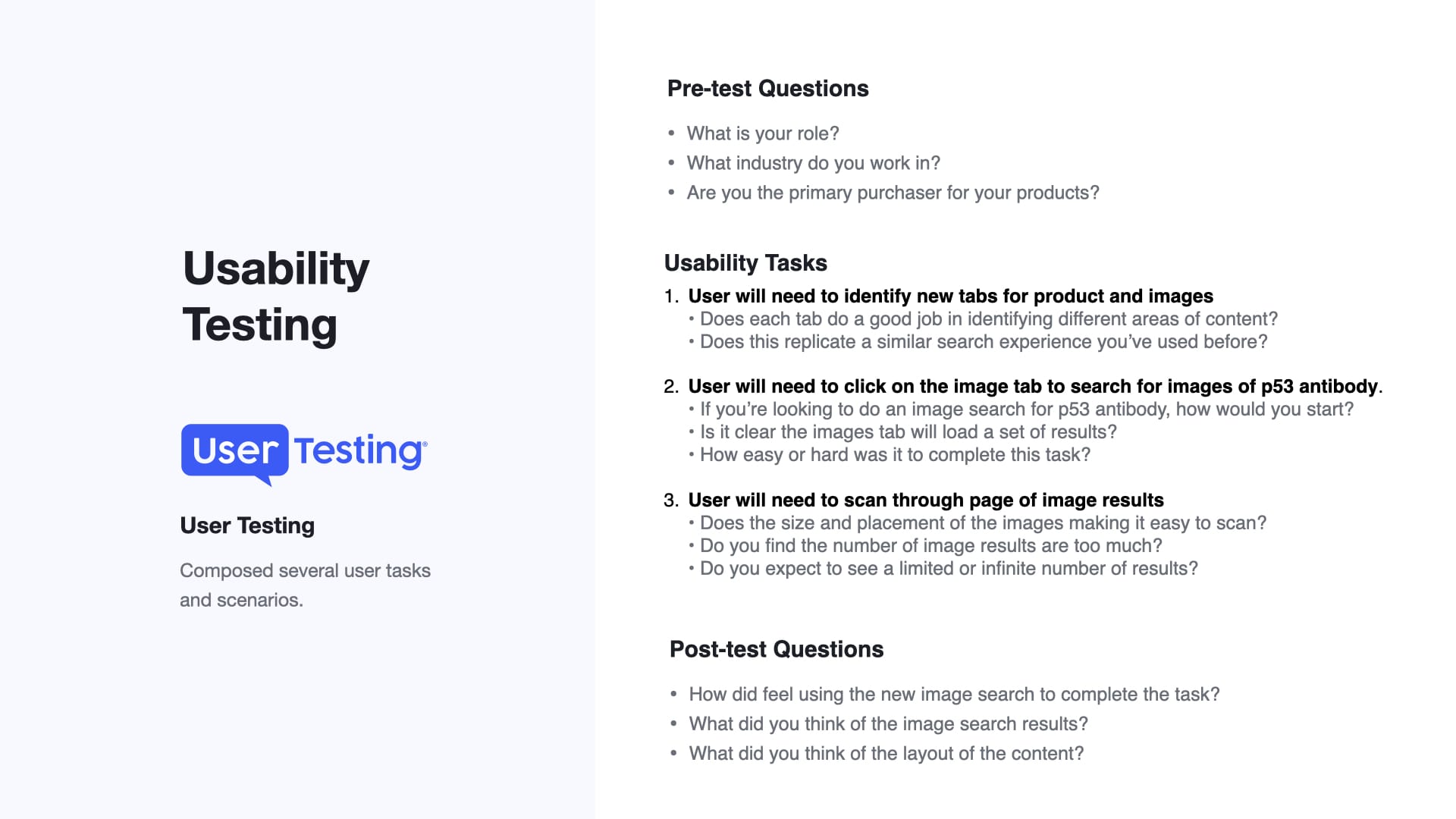
A few things we learned with usability testing:
- Grid Format: Users determined a uniform grid format provided the best balance of visual appeal and functionality.
- Images Tab: Users favored having a dedicated tab for image search to easily switch between different search views.
- Lazy Loading: Users wanted continuous image loading as they scrolled down the page.
- Image Overlay: Users preferred a slight overlay on images when hovered over, indicating the images were clickable.
- Quick View: Users liked a quick view that provides antibody information without navigating away from search results.
Solution
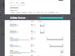
In crafting the solution, collaboration with the antibodies business was key. Together, we delved into multiple brainstorming sessions to unearth their insights and refine the user experience. Leveraging advanced algorithms and data tagging techniques, we worked with development to design a system capable of parsing through antibody-related data and display image results based on user-entered search terms. These images were thoughtfully curated to offer clear and informative representations of primary and secondary antibodies validated across various applications such as flow cytometry, IHC/IF/ICC, and western blotting.
View image search


Implementation
As the design matured, we collaborated closely with development teams to bring our vision to life. Working hand in hand, we ensured the smooth integration of the image search feature into the existing platform, maintaining consistency with the overall user experience. This phase involved meticulous attention to detail, with a focus on optimizing performance and scalability to ensure a seamless user experience across devices and platforms. Through rigorous testing and refinement, we ensured that the final product not only met but exceeded user expectations, delivering a truly enhanced antibody search experience.
Results & Impact
The introduction of the antibodies image significantly improved user experience and achieved impressive results.
- Conversion Rate: Increased by 25%, reflecting a more efficient and user-friendly search process.
- User Engagement: Increased by 30% on the search page, indicating users found the new design more helpful and informative.
Researchers now have a more intuitive and efficient way to explore and evaluate antibodies, leading to quicker decision-making and enhanced productivity in their research endeavors. User feedback has been overwhelmingly positive, with many expressing appreciation for the clarity and comprehensiveness of the image results.

