Thermo Fisher Scientific
iMATCH™ Sera Lot Matching Tool
Overview
In the realm of life sciences research, maintaining consistency and reliability in experimental outcomes is paramount. I led the UX redesign for Thermo Fisher Scientific’s iMATCH™, a groundbreaking Sera Lot Matching tool designed to streamline the process of finding the best match for researchers’ serum lots. With iMATCH™, researchers can swiftly identify the ideal serum lot for their experiments, whether by providing their Gibco FBS lot number or answering a few quick questions, thus enhancing experimental reproducibility and minimizing reagent-related challenges.
Challenge
The landscape of scientific research often grapples with the variability inherent in reagents, particularly in serum lots. Researchers face the daunting task of sifting through numerous options to find the most suitable match for their experiments. This variability introduces inconsistencies that can significantly impact experimental outcomes, leading to wasted time, resources, and unreliable data. Addressing this challenge necessitated the development of a user-friendly solution that would simplify the serum lot selection process and promote research consistency.
Research & Discovery
Working with internal stakeholders, we conducted user interviews and contextual inquiries to empathize with our users and better define their needs, behaviors, and challenges when selecting serum lots. We began with an in-depth analysis of the existing legacy tool, where we identified key pain points.
Legacy Version
The legacy version of iMATCH™ was an overly complex system with numerous options, which often left researchers feeling overwhelmed and frustrated. Navigating through the myriad of choices and configurations was a daunting task, leading to inefficiencies and errors in serum lot selection. Researchers struggled with the interface, spending excessive time trying to understand and utilize the tool effectively, which detracted from their primary focus on conducting experiments.

Ideation & Prototyping
We focused on transforming our insights from the research and discovery phase into tangible design solutions. Flowcharts were created to simplify the user journey and visualize the sequence of actions in the process. Prototypes were iteratively testing and refined based on user feedback, allowing us to validate design choices and narrow down our approach.
User Flow
In designing iMATCH™, one of the critical steps was to ensure that the user journey was seamless and user-friendly. To achieve this, I created a user flow diagram in Miro that mapped out each step and decision point researchers would encounter while using the tool. The goal was to create a clear, logical progression that would guide users effortlessly from start to finish, whether they were inputting an existing lot number or answering questions to find the best serum match.
Drag & Drop Exploration
We explored various ways to enhance the user experience, including a drag-and-drop feature for arranging specifications. This would enable users to customize their search criteria by rearranging and prioritizing specifications such as Endotoxin, Hemoglobin, pH, and Total Protein.
The drag and drop feature was proposed as an initial option during the design phase based on its potential to offer users flexibility and control over their search parameters. Through iterative prototyping and usability testing, we observed how users interacted with the interface and gauged their preferences and challenges.

Testing & Iteration
This phase was crucial in refining the design and ensuring that the tool effectively met user needs. After developing initial prototypes, we focused on gathering feedback from real users to identify areas for improvement. This involved multiple rounds of revisions, where we made targeted adjustments to improve the user experience.
Usability Testing
We conducted usability testing by recruiting internal stakeholders who frequently deal with serum lot selection and provided them with a series of tasks to perform using iMATCH™. Through remote sessions, we observed their interactions, gathered qualitative feedback, and identified pain points and areas for improvement. This iterative process allowed me to refine the tool’s interface and functionality, ensuring it met the needs and expectations of its target users.
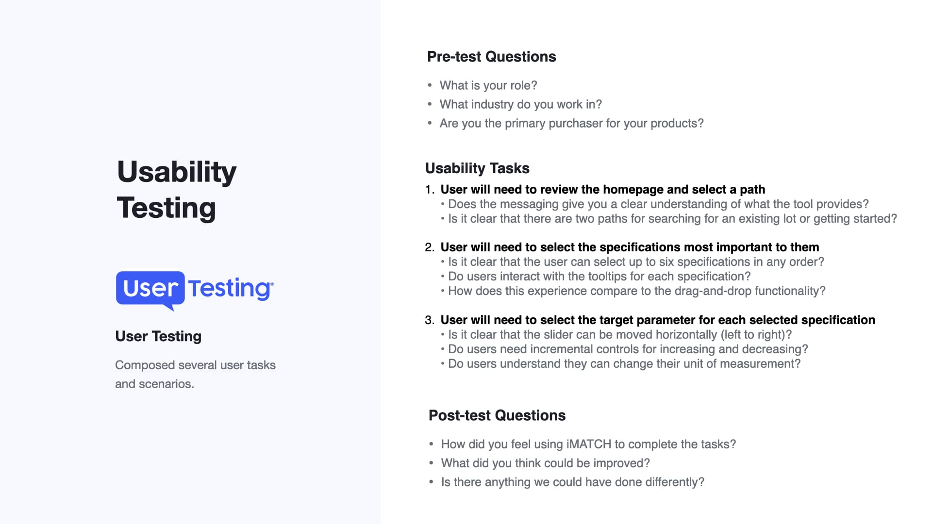
Here are few things we learned:
- Drag & Drop Exploration: It did not meet the desired level of usability and user satisfaction.
- Streamlined Navigation: Users want a guided experience with dedicated steps that provide a clear sense of progression.
- Path Direction: Users understood they could either enter an existing lot number or start the questionnaire flow.
- Specifications Ordering: Users understood they could arrange specifications in order of importance.
- Interactive Elements: Users like tooltips and sliders that provide real-time feedback when interacting with them.
Solution
iMATCH™ emerged as the solution to the complexities associated with serum lot selection. By leveraging advanced algorithms and user-centric design principles, iMATCH™ offers researchers a seamless experience in identifying the optimal serum lot for their specific research needs. Whether researchers input their Gibco FBS lot number or respond to a series of targeted questions, iMATCH™ swiftly analyzes data to recommend the most compatible serum lot. This innovative tool not only expedites the selection process but also ensures consistency across experiments, ultimately elevating the quality and reliability of research outcomes.


Signed Out
Users have the ability to click on a chip element to display match results, facilitating easy comparison between the target parameter and the best match. This feature was designed to enhance user efficiency by providing a compact summary of match results directly on the results page. Upon completing the matching process, users could interact with the Match Results Chip to access detailed information about the best match. By simply clicking or tapping on the chip, users could open a drawer to reveal comprehensive data, including specifications, compatibility metrics, and other relevant details.
This approach streamlined the process of evaluating match results, allowing users to quickly assess the suitability of each match without navigating away from the main interface. The drawer functionality ensured that match details were easily accessible yet unobtrusive, preserving the overall clarity and simplicity of the user experience.
Furthermore, to access customer-specific pricing and availability information, users were prompted to sign in to their accounts. This added layer of authentication ensured that users received accurate and personalized pricing details based on their account status, enhancing transparency and trust in the purchasing process.


Signed In
Users will have the ability to click on an availability element to show all serum products that matched their selected criteria. This included catalog number, unit size, price, and availability status. By enhancing transparency, we allowed users to make informed decisions about their order.
To further streamline the purchasing process, users were given the option to add desired items to their cart directly from availability drawer. By simply selecting the desired quantity for each product and clicking the “Add to Cart” button, users could efficiently compile their order without navigating to separate product pages or checkout processes.


Mobile
In designing the mobile experience for the iMATCH, we prioritized a responsive design approach, ensuring seamless adaptation to various screen sizes and resolutions. We streamlined navigation with a hierarchical structure and optimized layout for clarity and readability. Touch-friendly interactions, such as large, tappable buttons, were implemented to facilitate effortless navigation. Through rigorous testing and iteration, we refined the mobile interface to provide users with a seamless, intuitive, and efficient experience when accessing and utilizing the iMATCH tool on their mobile devices.

Conclusion
In conclusion, iMATCH™ stands as a testament to the power of strategic UX design in addressing complex challenges within the scientific community. By prioritizing user needs and leveraging innovative technology, iMATCH™ has revolutionized the serum lot selection process, empowering researchers to achieve greater consistency and reliability in their experiments. As research continues to evolve, iMATCH™ remains committed to supporting researchers in their quest for scientific excellence and discovery.


